“How might we redesign the layer list widget so it can be used by web, mobile and desktop ArcGIS applications as well as 3rd party developers using the API?”
Introduction
The goal for this project was to redesign the Layer List in ArcGIS Javascript API. The layer list widget is a primary widget that hierarchically displays the layers in a map and provides easy access to common layer actions. Since it was a part of the API, it would be used by internal and third-party developers to customize and embed layer lists in their web apps that use mapping. The design solution had to be considerate of these use cases.
Team:
Lead UX Designer
UX Designer (me)
Product Engineer
Duration:
1.5 months
My Role:
Competitive research
User research
Wireframes
Problem Overview

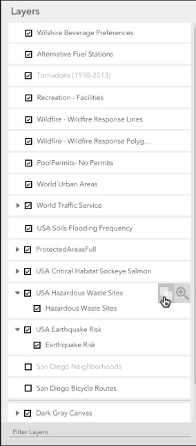
Layer List (right side panel)
The current layer list had a few known design issues:
The checkboxes were indicators of a layer’s visibility in a map. However, in grouped layers, it was unclear when individual layers and the parent layer were visible.
The common layer actions were not available as a part of the API which created an inconsistency in design across all products that used layer actions. We had to determine what these common actions would be from users and stakeholders.
For a large set of layers, it was difficult to search for a layer or filter the list in any way.
Research
“A layer list can be thought of as a repository of complex data items with access to their core properties.”
Competitive Research
We looked at layer lists in different applications and divided the competitive research into 3 parts.
GIS applications: Mapbox, Carto, Google Earth.
Non-GIS applications: Adobe Photoshop, Adobe Illustrator, Sketch.
ArcGIS applications: ArcGIS Online, ArcGIS Pro, ArcGIS Earth.
This helped validate the need to build the common actions at the API level - to provide some consistency in design across all layer lists.
User Research
While planning for user research, I found that we were actually designing for two types of end users - developers and GIS professionals. We spoke to a number of GIS experts and app developers to understand the key requirements of the layer list.
We found that app developers wanted to customize the common actions depending on the app - while GIS experts wanted the layer list to be clean and easy to use.
This helped up come up with a list of design requirements to fulfill both users’ needs.
Design Requirements
For the developer:
Access to common layer actions with ability to customize the action as per the application.
Allow for single tap/selection state of layer to be customizable by app developer (do not overload selection interaction).
Ability to define where the layer list lives on the screen (do not make interaction designs that work for only one side/type of layer list).
Mobile and web-friendly interactions.
For the GIS professional:
Distinction between a layer visible on map vs. out of map extent.
Ability to search and filter to a layer.
Access to common layer actions.
Clear and easy distinction between group layers, parent and child layers.
Designs
We did rounds of 360-degree sketching - a process of rapid sketching, presentation of concepts and iterating in a loop. We also tried pairaphor sketching - two designers alternately taking on roles as generator and synthesizer of the same concept.

Wireframes
The new layer list design included layers represented as cards. This helped distinguish between grouped layers since the whole group was bounded by one card.
The widget was not fixed in size or location and those properties could be customized by the app developers.
There was a tristate (checked, unchecked and dashed line) checkbox to convey the visibility states of parent layers and child layers.
Search and Filter: A search bar is added at the bottom of the layer list. Layer hierarchy is maintained when user searches for a layer by greying out the layers that do not match the query. Search is based on layer name for v1.

Common layer actions: On hover (web) or swipe (mobile) interaction, user can access the layer’s common actions as the card slides to reveal them.
Pane flip: If developer wants to add more common actions, they can configure the list to show more actions. Once the user taps on it, the pane of layer list flips to reveal a list of configurable actions at the back. This helps make use of the available real estate, which is scalable to all apps.

Reorder layers: The card style of layers provides space for moving and reordering the layers within the list. This change in hierarchy is to be reflected in the map in the same order. There is a cursor change, and an indicator of a source and target location while the user drags and drops the layer card.

Layer List - in Action!
The final implementation of the layer list as shown below. One noticeable change is the removal of the tristate checkbox because it was found to be confusing during user testing.

Sample code: Layer list with actions